Basic plots
The everyday XY plots. All accept x and yarrays or data= and x and y as string column names, an optional spec=, ax= and backend agnostic overrides. All support
hue= / group=.
import numpy as np
import behaviz as bv
import polars as pl
bv.set_renderer("matplotlib") # can also be "seaborn" or "bokeh"
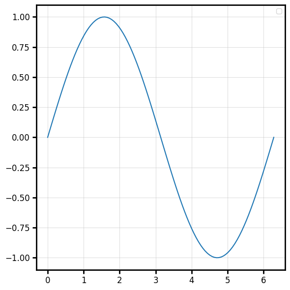
x = np.linspace(0, 2 * np.pi, 100)
y = np.sin(x)
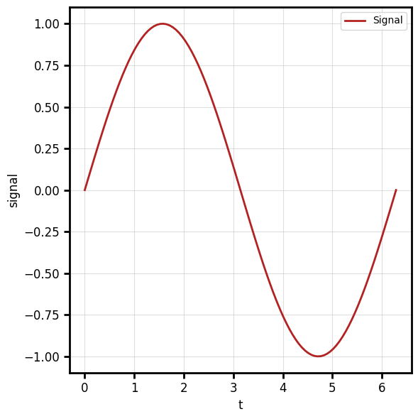
df = pl.DataFrame({"t":x,
"signal":y
})
Line — plot_line
bv.plot_line(x, y)
When plotting from a DataFrame, the column names are automatically set as axis labels
bv.plot_line("t", "signal", data=df, color="firebrick", linewidth=2, label="Signal")
Channels: x (vector), y (vector, same length as x).
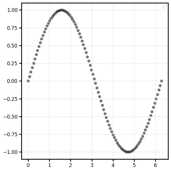
Scatter — plot_scatter
bv.plot_scatter(x, y, color="k", alpha=0.5)
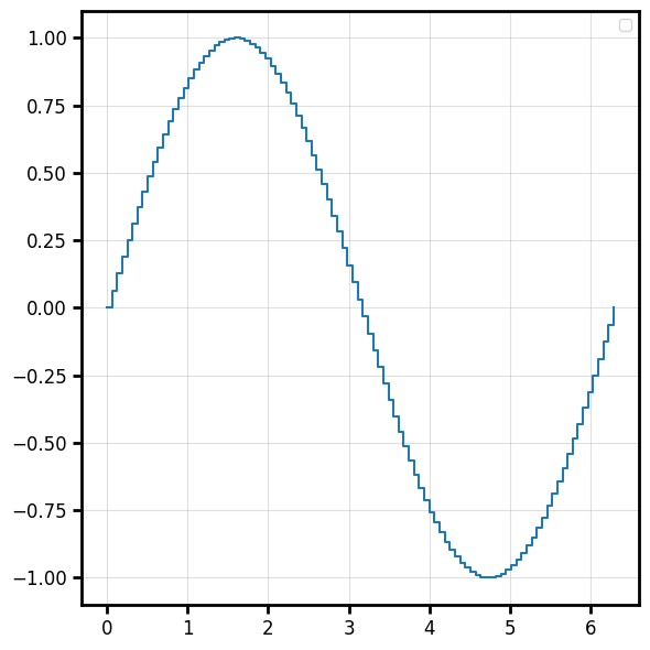
Step — plot_step
Staircase line. where controls where the step happens ("pre", "post", "mid").
bv.plot_step(x, y, where="post")
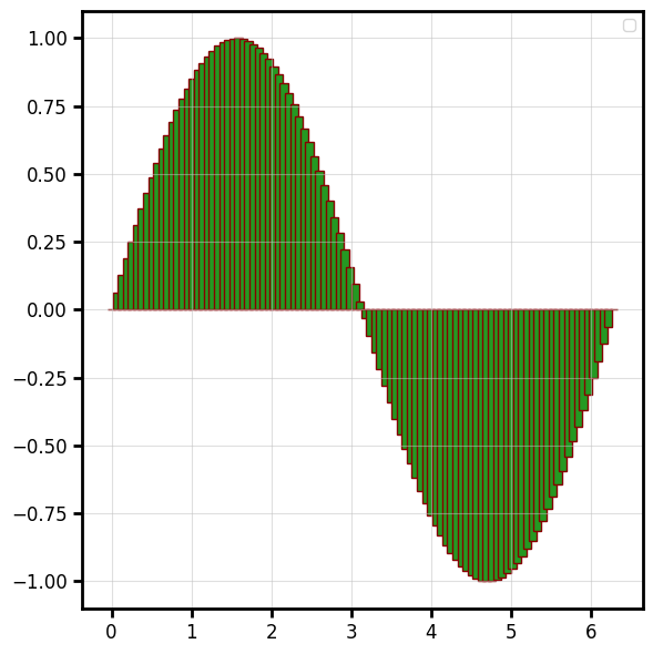
Bar — plot_bar
bv.plot_bar(x, y, width=0.1,color="#249922",edgecolor="#880000",linewidth=1)
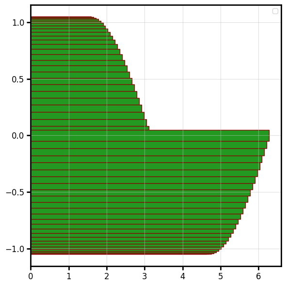
Horizontal bar — plot_hbar
bv.plot_hbar(y, x, ax=ax,height=0.1,color="#249922",edgecolor="#880000",linewidth=1)
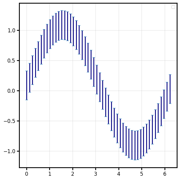
Error bars — plot_errorbar
lower = np.full_like(y, 0.15)
upper = np.full_like(y, 0.33)
err = np.vstack([lower, upper])

bv.plot_errorbar(x[::2], y[::2], err[:,::2],color="navy", capsize=3, elinewidth=2, linewidth=0)
Override the cap/line styling with capsize=, elinewidth=, ecolor=, capthick=
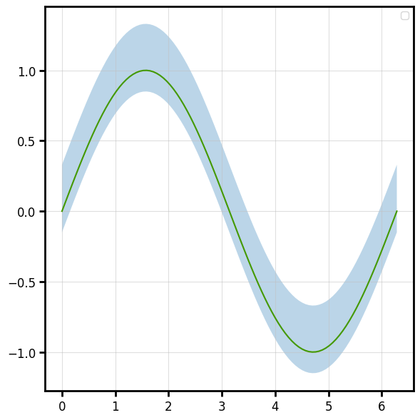
Fill between — plot_fill_between
A shaded band between two curves (or a curve and a constant).
f,ax = bv.plot_line(x,y)
bv.plot_fill_between(x, y-lower, y+upper, ax=ax,alpha=0.3)
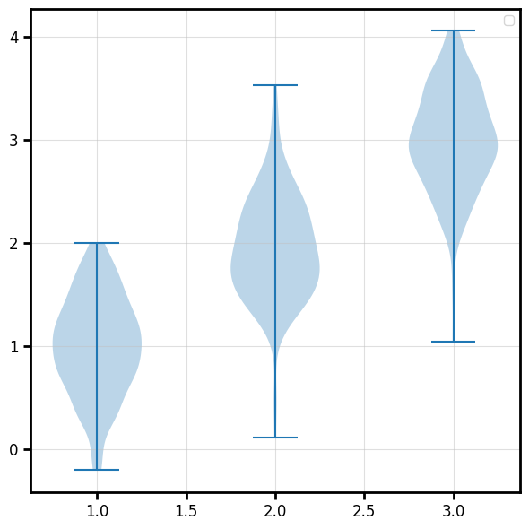
Violin - plot_violin
rng = np.random.default_rng(0)
positions = np.array([1.0, 2.0, 3.0])
distributions = [rng.normal(loc=p, scale=0.5, size=200) for p in positions]

fig, ax, vp = bv.plot_violin(positions, distributions)
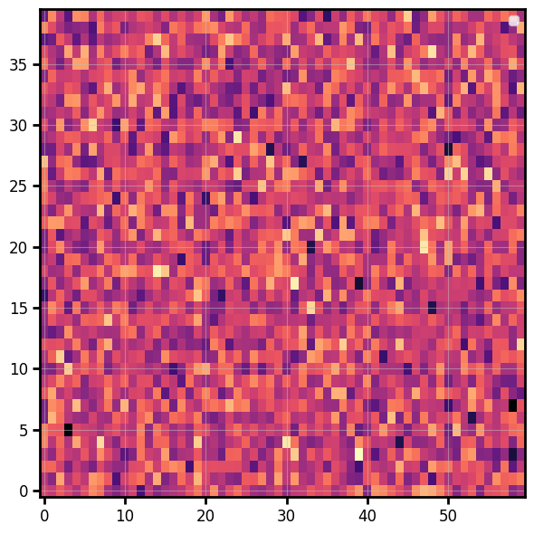
Image
Display a 2-D array as a colour-mapped image (heatmap):
data = np.random.default_rng(0).normal(size=(40, 60))
fig, ax = bv.plot_image(data, origin="lower", cmap="magma")
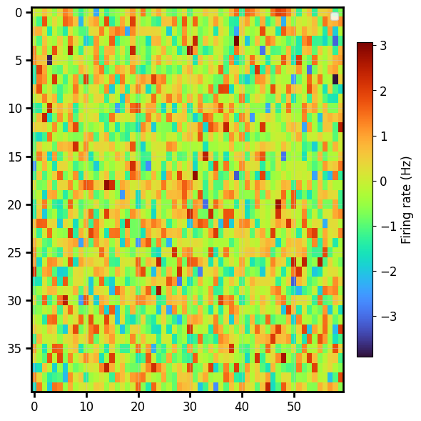
Colorbar
A matplotlib colorbar normally means capturing the mappable and wrestling with sizing. Here it's one opt-in keyword, and the bar is auto-sized to match the image height:
bv.plot_image(data,cmap="turbo",colorbar="Firing rate (Hz)") # a string is the label
For full control, pass a ColorbarSpec — the same call works on every backend:
from behaviz import ColorbarSpec

cbar_spec = ColorbarSpec(label="Hz",
                         location="bottom",
                         ticks=[-2, 0, 2],
                         tick_fmt="%.0f")

bv.plot_image(
    data, cmap="viridis",
    colorbar=cbar_spec,
)
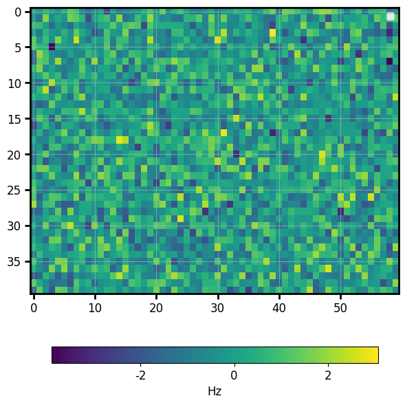
plot_imagecurrently handles 2-D scalar arrays; RGB(A) images are on the roadmap.
Pie
fig, ax = bv.plot_pie([30, 25, 15, 30], labels=["A", "B", "C", "D"], autopct="%.0f%%")
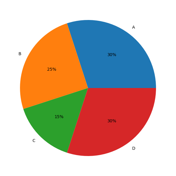
(autopct is matplotlib/seaborn only; on bokeh the slice labels are drawn inside the wedges.)
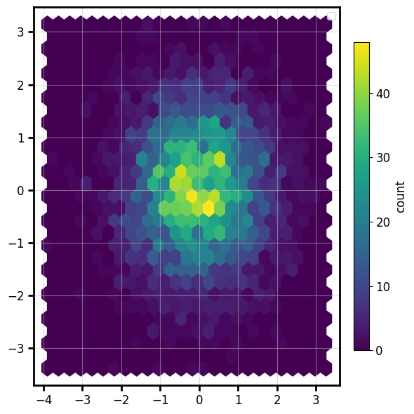
Hexbin
A 2-D histogram of raw point data, binned into hexagons and coloured by count — with the same
opt-in colorbar:
rng = np.random.default_rng(0)
px, py = rng.normal(size=4000), rng.normal(size=4000)
fig, ax = bv.plot_hexbin(px, py, gridsize=25, cmap="viridis", colorbar="count")